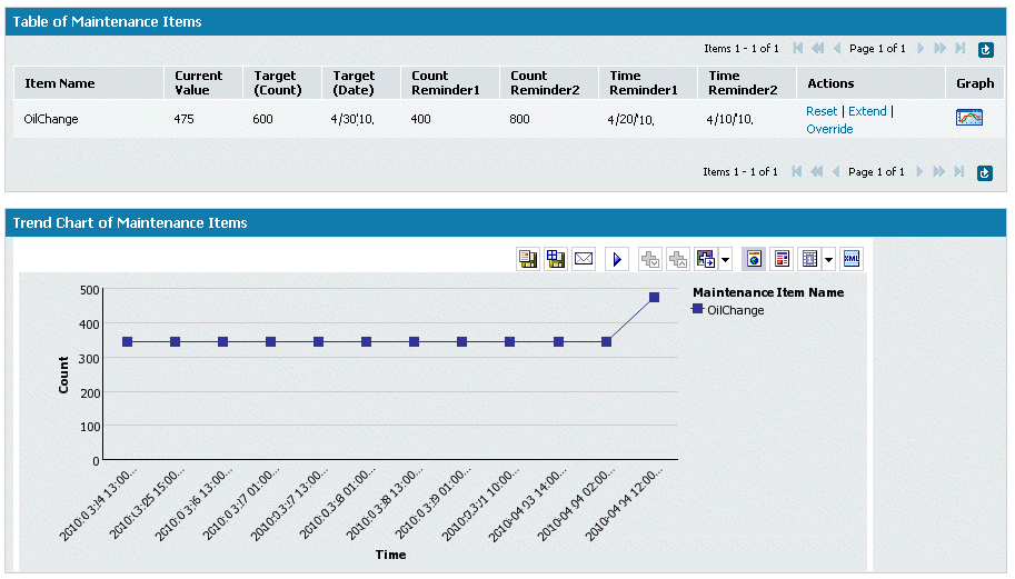
In the center of the Maintenance Asset dashboard is a Trend Chart that shows historical and projected information for a selected maintenance item associated with an asset. This chart shows information from the previous four weeks through today, and from today forward four weeks. By default, the chart shows the trend for the first maintenance item in the table.
The information includes historical data (if available), the current counter value, the predicted run rate curve, and the crossing point for the target (date or time) if it is within the chart window. To view the line graph for a maintenance item, click the Graph icon for the maintenance item of interest. When the page refreshes, the line graph for the selected maintenance item is displayed in the Trend Chart area. Using your mouse, hover over the icons to see the tool tips for the various tools you can use to save the trend chart or view it in a different format.
The following shows an example of a trend chart:

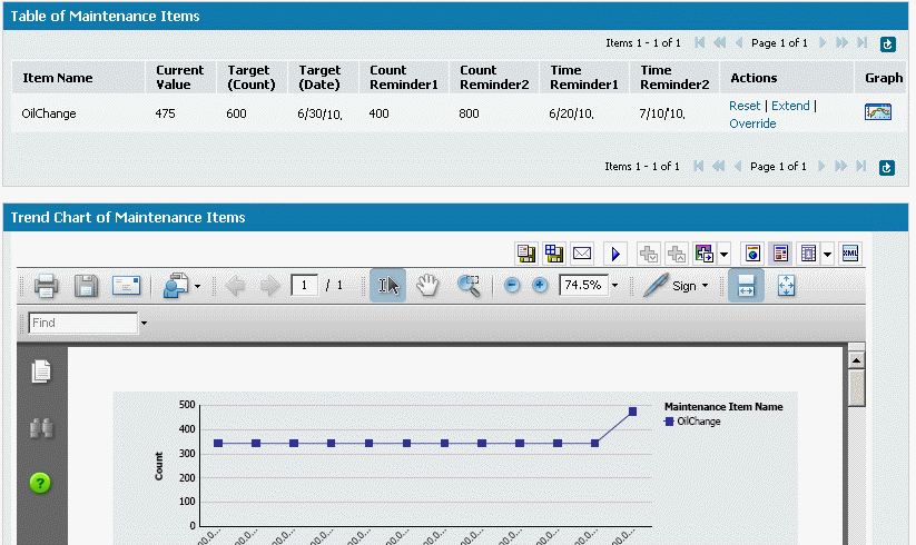
You can use the icons in the chart view to display the chart in different
formats. For example, if you want to save the chart to a PDF file and
print it, click ![]() . The following
shows the example above in PDF format:
. The following
shows the example above in PDF format:

To change the current Counter value, the Target Count value, or the Target Date, you must have the appropriate privileges. If you have the privileges, you can use the links in the table above the chart (Reset, Extend, or Override). Any changes you make are recorded in the audit log shown below the chart.