Each type of chart contains tools for modifying the information displayed in that chart.
You can chart multiple historical data items for the asset in a single chart. The chart applies unique colors and icons to the data items, which help you to distinguish the values shown in the chart.
Once a chart contains the data items you want to trend, you can magnify the chart display to better view the trended values, and, for strip charts, add markers to plot data values or time periods of interest. You can use the zooming and tracking tools to view and analyze the data.
From this page, you can select a specific type of chart to view; and change the magnification for viewing the chart.
Tip: When you refresh a history chart (by clicking Refresh), the selected time is set to the middle of the chart window. You can select the data items to show in the chart, the time span for the chart, and the samples interval to show in the chart.
Use the mouse to "rubber-band" (select) the chart area to zoom. Click the starting area in the chart to zoom, drag the mouse to the ending area to zoom, and then release the mouse button. The selected area is magnified.
or
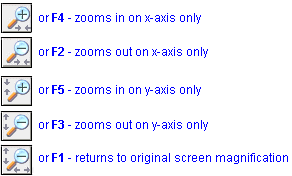
Use the zooming buttons (for history charts) or associated function keys, as follows:

In the chart's Legend, locate and click the name or icon for that data item. In the chart display, the data values and associated x- and y- axes are brought to the forefront.
(This functionality does not apply to Bar Comparison charts.)
Point to the chart time or area of interest. The position appears above the chart, as a time and an x- and y- axes position.
![]()
(This functionality does not apply to Bar Comparison charts.)
Contact Axeda Technical Support for more information about creating custom charts for your Axeda® Platform.